Which Office Colours Improve Productivity? An Office Design and Fit Out Guide for Your Industry
Colour and design aren’t mere decorations. In office design and fit out projects, they shape productivity, influence employee wellbeing, and affect client perception. They also guide office refurbishment services, where updated colours refresh culture and morale. From our experience on projects, businesses often underestimate how colour choices affect daily performance and brand expression.
This guide explores how colour psychology shapes the workplace, which palettes suit different sectors, and how to make practical design decisions that align with brand and staff needs. Whether planning a refurbishment or a new office design and fit out, the principles remain the same: colour decisions matter.
What Is Colour Psychology in Office Design and Fit Out?
Colour psychology looks at how colours influence behaviour, mood, and focus. In workplace fit out projects, it helps create spaces that look right and function well for employees and visitors. The wrong palette can cause visual fatigue, while the right one supports concentration and satisfaction.
Blue is commonly linked with focus, which is why finance teams often specify it. Green restores balance and calm, useful in healthcare settings. Yellow and orange can stimulate energy and creativity, but only in moderation. Neutrals such as grey, beige, or off‑white convey professionalism and reduce distraction.
Which Office Colours Improve Productivity the Most?
Blue often supports concentration, especially in finance and tech teams. Green promotes calm, which works well in healthcare and wellbeing settings. Yellow or orange, used sparingly, can spark creativity in marketing or design offices. Neutral palettes bring authority and reduce distractions, making them suitable for law firms and corporate environments. As a guideline, keep accent colours to around 10–15% of wall space to avoid overwhelming the eye.
When integrated into an office design and fit out strategy, these colour choices reinforce other design elements such as lighting, furniture, and layout.
How Do Daylight and Colour Work Together?
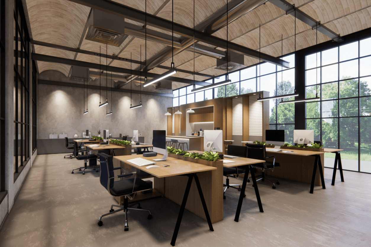
Research links greater daylight exposure with better sleep, higher activity levels, and improved wellbeing. Use higher Light Reflectance Value (LRV) walls to bounce daylight deeper into the floorplate. Keep ceilings light to avoid a boxed‑in feel. Add glare control and balanced task lighting. When planned together, colour and daylight create offices that feel healthier and support stronger performance.
Which Office Colours Work Best for Different Industries?
Professional services such as law and finance often use greys, blues, and muted neutrals to establish trust and authority. Tech and creative companies benefit from brighter accents such as yellow, orange, or purple to encourage collaboration. Healthcare and wellness spaces lean on greens and softer tones to reassure staff and patients. Retail and hospitality headquarters often use bold accents to reflect brand energy and connect office culture with the consumer experience.
How Does Office Colour Impact Employee Wellbeing and Retention?
Want to see how colour choices can boost morale and retention in your own workplace? Bates Studio provides expert office design and fit out services tailored to your industry. Talk to us today about creating spaces that work for your people.
Looking for expert advice on colour choices that support your team’s wellbeing? Bates Studio helps companies deliver designs that minimise disruption while improving comfort. Contact us to discuss your options.
Colour influences wellbeing and retention. Offices that balance calming palettes with collaborative spaces reduce stress and help keep talent. Morale dips fastest in sterile all‑white spaces. Introducing thoughtful colour zoning can lift morale. Poor choices can lead to rework, which costs more once staff occupy the space.
In our office design and fit out projects, the strongest results come from palettes that support task types. Our wider services such as space planning and workplace consultancy and furniture solutions ensure colour decisions align with layout and daily workflows.
How Can Colour Support Neurodiversity?
Bright, high‑chroma contrasts and shiny finishes can cause sensory discomfort for many people. Calmer tones in focus areas and simple patterns in circulation routes create comfort. Use bold accents only in collaboration zones and balance them with neutrals. These adjustments improve inclusivity without compromising brand expression.
How Can Office Design and Fit Out Balance Brand Identity with Colour Psychology?
A mistake we often see is when companies design offices as brand showrooms rather than workplaces. Covering every wall in brand colours looks striking but quickly overwhelms staff. A better approach layers brand colours as accents and balances them with supportive palettes. For example, apply strong brand tones in client‑facing or breakout areas while keeping focus zones neutral. This balance impresses visiting clients and keeps staff comfortable. It also supports recruitment, as prospective employees often see the workspace during interviews and judge culture and professionalism.
What Mistakes Should You Avoid When Choosing Office Colours?
Going all white creates a sterile and uninspiring feel that damages morale. Overusing bright colours distracts and causes fatigue. Ignoring lighting creates risk because colours shift under poor conditions. Following trends without considering staff or brand needs often leads to expensive reworks. Always test palettes under real site conditions before sign‑off to avoid surprises. Skipping this step often means repainting or retrofitting after staff move in, which costs more and causes disruption.
How Do Lighting and Contrast Affect Colour Choices?
Test your palette under both daylight and your actual LED specification. Use LRV to make sure tones read clearly on walls, doors, and circulation routes. Aim for a difference of about 30 LRV points between adjacent surfaces for accessibility.
Should You Choose Low‑VOC Paints for Office Interiors?
Yes. Standard paints can emit volatile organic compounds (VOCs) after application. Specify low‑VOC products, confirm certification, and schedule curing and flush‑out periods before occupation. This keeps air quality high and aligns with modern wellbeing standards. They also support recognised sustainability frameworks such as WELL and BREEAM.
How Do You Choose the Right Office Colours Step by Step?
Start with an audit of daylight, tasks, and brand needs. Define zoning for focus, collaboration, and client spaces. Build a palette with a neutral base, supportive hues, and carefully placed accents. Test mock‑ups in situ under actual lighting. Gather staff feedback to catch issues early. Specify RAL or NCS references, sheen levels, and VOC requirements before handover.
A structured office design and fit out process ensures these steps translate into practical results that work long‑term.
Why Partner with Bates Studio for Smarter Office Colour Choices
Colour shapes how staff work, how clients view your brand, and how your culture comes across. Choosing the right palette for your industry is a business decision with measurable impact on morale and retention.
At Bates Studio, we bring colour psychology into every office design and fit out project, as well as targeted office refurbishment services when clients want to refresh existing spaces. Because we deliver fit‑outs, refurbishments, space planning and workplace consultancy, furniture solutions, project management, aftercare, and small works, our advice comes from real project experience. Our guidance comes from what we’ve delivered on site, not from theory.
If you’re ready to make colour work harder for your office, get in touch with us. We’ll help you design a workplace that supports your teams, protects your budget, and impresses your clients.
FAQs
What colour is best for office productivity? Blues and greens help focus and create calm.
Do different industries need different office colours? Yes. Law firms often rely on muted neutrals. Creative teams typically benefit from brighter accents.
How does colour affect employee mood? Balanced palettes ease stress. Energetic accents can spark creativity.
Should brand colours always be used in office fit outs? Use them carefully as accents. Overuse overwhelms staff.
What mistakes should you avoid when choosing office colours? Avoid sterile all‑white, excessive brights, ignoring lighting, and trend‑chasing.
What’s an acceptable LRV contrast in offices? About 30 LRV points between adjacent surfaces improves legibility.
Are low‑VOC paints worth it? Yes. They protect air quality, support wellbeing, and help meet standards like WELL and BREEAM.
Do neuroinclusive offices avoid colour? No. They use calmer palettes in focus zones and controlled accents in collaboration areas.